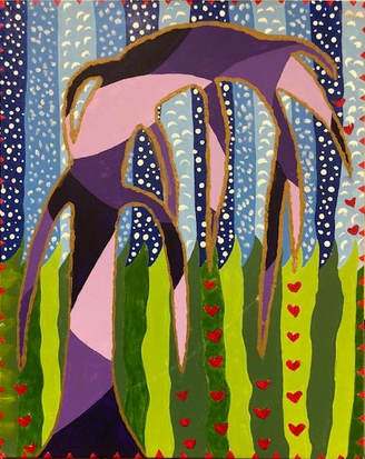
Bob Ross Painting
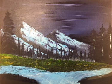
Ever since I watched one of Bob Ross’s videos I have always wanted to follow along. Now that I have.. it’s a lot harder than I thought. That man makes it look so easy! I really did love doing this and I’m so glad it was in my art class as well. People all around were stessing out and worrying, but I was not worrried about one thing. You just have to go with the flow, man. The one thing I like the most about this is all the colors that were used.
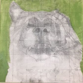
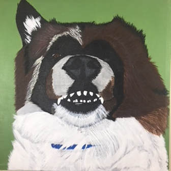
Pet Portrait
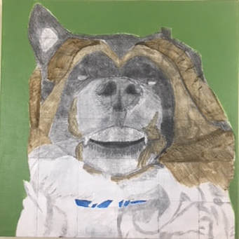
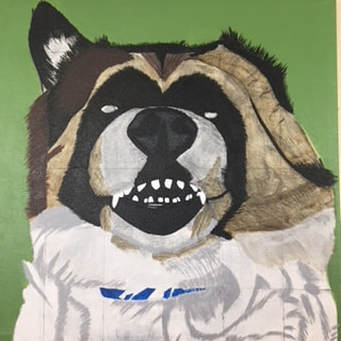
Final
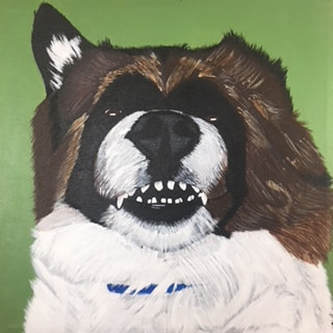
This painting is a pet portrait of my best friends dog named Axle. The way this painting was completed by doing a acrylic wash. Which is to layer on the acrylic colors that are mixed with some water, so you can get as much detail out of the piece as you need. Axle's colors were hard to work with on this painting. The whites against the black and drowns. Then doing highlights in the brown fur. The shadows in the white were very difficult to plan out and not make then look like some random splotches of grey. I do think I accomplished that part well though. Overall I am very pleased with the way the piece came out. Layering in this piece took a lot of time to do. To accomplish layering you needed to put down a wash of the darkest color, then start to layer each color from darkest to lightest getting the desired amount of detail that you want. Blending of this piece was done by taking one of the sides that you wanted to blend and move the fur over on the other side. Once that side is done you do the same to the other and you should end up with a nicely blended section of fur. Texture was created by the uplift of each little stroke of fur. One of the most important aesthetic quality of my artwork was the highlights and the shadows all in the fur. It would look far from a dog if those qualities were not there. The creative process wasn't much, all I had to do was pick out my favorite picture of a dog and just copy all of the qualities I see. My growth throughout this piece was pretty amazing I think. The beginnning looked messy and it seemed like it wasn’t going to all come together. I knew that I just needed to do the right amount of detail and not add to much of anything. I really enjoy looking at the quality of my artwork, this one by far, is the greatest piece I have painted in this class. He looks like a real dog, the fur looks realistic, and the picture that it came from is pretty comparable to it. I love this piece.
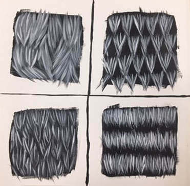
Fur Practice
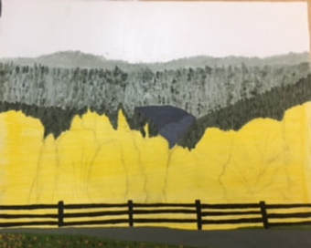
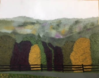
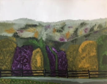
Landscape with Oil Paints
. Final
I think the craftsmanship of my painting could use a little bit of work. It is not the neatest piece that I have done, but it is a landscape of a forest so it’s not supposed to be too neat anyways. The colors that I turned to in this artwork were earthy tones. My reference photo was taken during Autumn so I revolved all of my colors around that season. I created contrast in my work with the trees, the yellow against the purples and greens and vice versa. I applied textures in the piece by stippling the brush all over the trees. Some highlights came from the fence, making it look a bit more realistic. Also highlights were used in the trees. Shadows came into play when the trees were overlapping each other, and in the background where the trees are further away. I was able to create depth in my painting by making the trees in the foreground more detailed and the background of the piece more fuzzy and blended. Some techniques that I used were creating different values all over the painting. Another was creating texture in the trees to give it a more realistic look to it. My painting changed a lot during this process, before I was creating the entire scene with direction. In turn nature has no direction, so I needed to create more randomness in my piece. Once I did that, things started to come together much more and started to look like an actual scene of a forest. To improve my painting I would like to go back and be more careful with all of my brush strokes so the craftsmanship of the piece would be a lot nicer. I beieve that could make a big difference. I think I did well on the trees in my piece, that part is my favorite. I liked the colors I used for them, I think it gives it a very calming effect to the piece.
I think the craftsmanship of my painting could use a little bit of work. It is not the neatest piece that I have done, but it is a landscape of a forest so it’s not supposed to be too neat anyways. The colors that I turned to in this artwork were earthy tones. My reference photo was taken during Autumn so I revolved all of my colors around that season. I created contrast in my work with the trees, the yellow against the purples and greens and vice versa. I applied textures in the piece by stippling the brush all over the trees. Some highlights came from the fence, making it look a bit more realistic. Also highlights were used in the trees. Shadows came into play when the trees were overlapping each other, and in the background where the trees are further away. I was able to create depth in my painting by making the trees in the foreground more detailed and the background of the piece more fuzzy and blended. Some techniques that I used were creating different values all over the painting. Another was creating texture in the trees to give it a more realistic look to it. My painting changed a lot during this process, before I was creating the entire scene with direction. In turn nature has no direction, so I needed to create more randomness in my piece. Once I did that, things started to come together much more and started to look like an actual scene of a forest. To improve my painting I would like to go back and be more careful with all of my brush strokes so the craftsmanship of the piece would be a lot nicer. I beieve that could make a big difference. I think I did well on the trees in my piece, that part is my favorite. I liked the colors I used for them, I think it gives it a very calming effect to the piece.
Oil Painting Practice
This piece is not finished completely, but working with oils and trying to use detail is very difficult and it takes a lot of patience. The only think that seems to work for me with this piece is my shading values, on the pepper for example. Other than that I think I still have work to do with my oil practice.
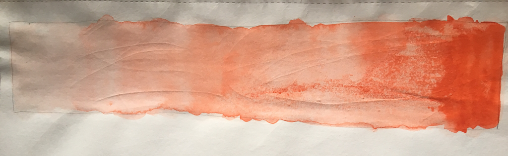
Oil Painting Practice
This is my first time using oil paints to complete a piece. I really like the texture of oils but that is about it. It was difficult for me to get any of the paint flat, and trying to put some details in there... oh man. Oils paints also do a really good job with blending, the paint acts very soft which is exactly what you want in a gradient.
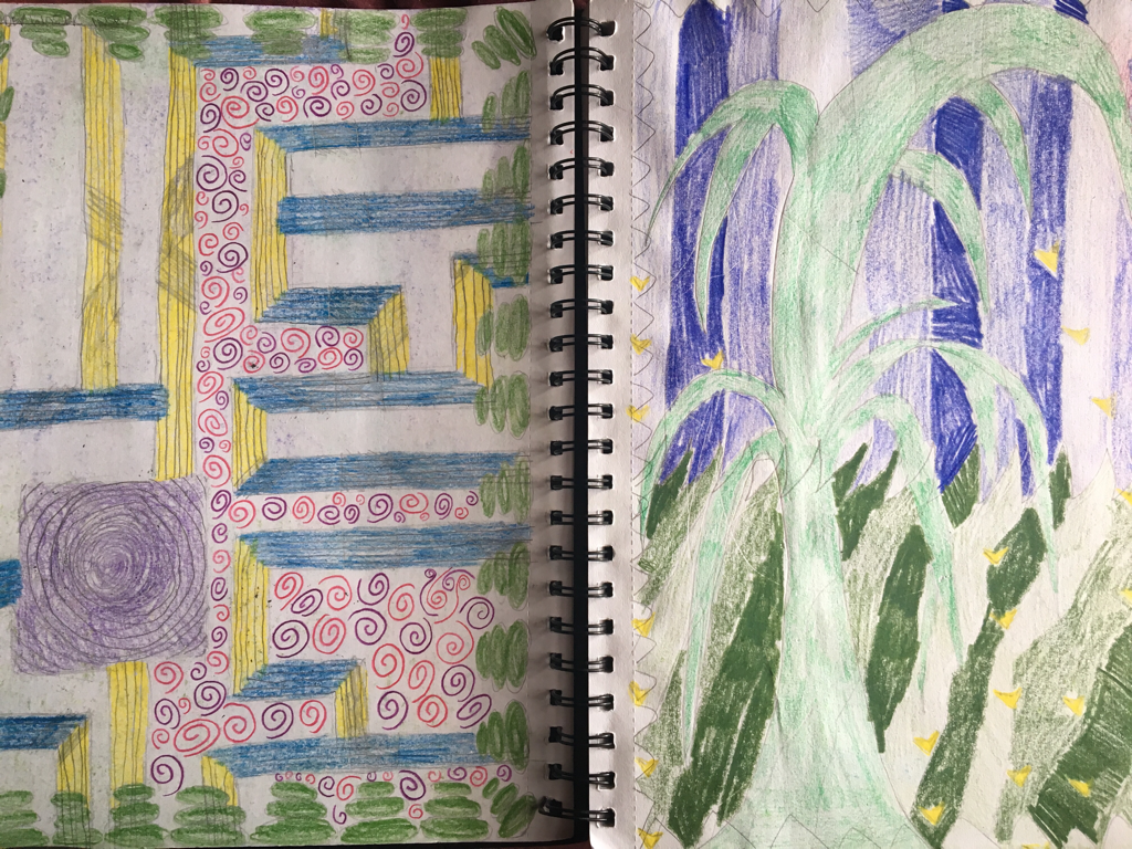
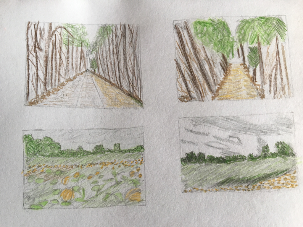
These were my 2 sketches for the project.
Hunderwasser Inspired
I think the craftsmanship of this art work is pretty good, I did really take my time trying to make the colors pop against each other. I embodied Hunderwasser's style buy making the tree the center of focus and using repetition in the sky. Also creating the entire scene two-demensional. I used hues of greens to create the bottom half of the painting, the grass. Then I used hues of blue to create the top half of the painting, the sky. Then also using different hues of purple to create the figure of the tree. The focal point of this piece is the tree with the gold lining around it. To create texture to my piece I took the end of a painting brush and created dots in certain areas of the sky, also in the sky I used the end of a mixing kinfe to create little crescents. The boarder on my piece is just triangles pointing inwards surrounding the entire edge. The red enhances the rest of the painting to draw you to the center. The only thing I found difficult in the creation of this piece is trying to find repition to put into the work. I didn't know what shape that was organic and flowed with the art work, but I tried to get creative with it and this is what it turned out to be.
Value Chart
This here is a value chart and this chart represents the gradient of a color.
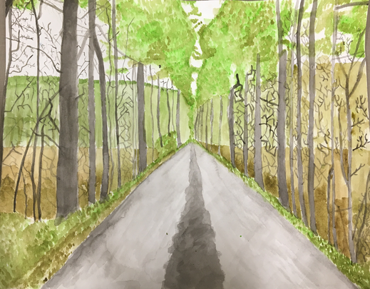
Watercolor Project
These are the composition pieces for the watercolor project.
Final
The techniques that I found useful for my art work is the wet on wet method and the dry brush method. The wet on wet helped me create the middle and sides of the path that is going up the page. The dry brush helped me draw all of the branches in the trees, by using little strokes. It was pretty impotant to use transparent layers in my painting because the trees needed to be darker than the rest of the photo but I couldn't just paint them straight black right away I had to layer the colors with the rest of the painting. The area that turned out the best in this piece, I think, is the grey gravel in the front of the piece. I think I worked with most of the principles of design, by using rhythm in the trees and the bushes and leaves. I also used movement in my piece by having the path dissapear into the distance. Yes the color choice was very important because I was trying to make it look somewhat realistic, even thought it doesn't completely look like it is, the color choice helped with that. My craftsmanship in this piece could have been a lot better, but I really dislike watercolor and I didn't spend as much time on it as I could've. If I was able to do something different with this I would've wanted to work on my techniques more, so I could really use them in my piece. Something I have learned about watercolor is that you need to be patient with the material. It's not like Arylic where you can dip your brush and start drawing, you need to get the right color and the right shade of that color. It just takes more time to work with it. It has discouraged me a little bit but I know through the whole project I didn't like working with it so I didn't try my best.. but I still completed it.
August 30 2017
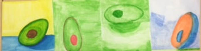
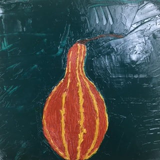
These paintings are supposed to be avacados. The assignment was to pick a fruit and paint in different color schemes. The first one is warm colors, this one seemed to work the best for me I think. The second was complementary colors, I choose red and green and in this one I rlly need to work on my definition of my objects. The third is monochromatic the only thing I sorta like about this one is the shading at the bottom. The fourth was split-complementary, this avocado is kind of dead looking. I just need to practice some more. A lot more.
September 5 2017
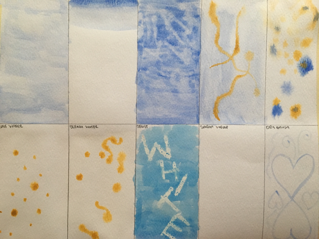
Today continuing to work on water color, we worked on different techniques of painting water color. I think it's pretty difficult to work with, just lots of practice. The one I liked practicing the most was resist. The way your art work just appeares just by brushing over it is pleasing.
 RSS Feed
